

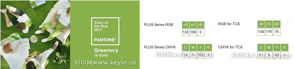
 Since 1999 December, the PANTONE color study group every year to determine next year's annual color, in the evening of December 8, 2016, the global color authority and professional color standard suppliers PANTONE announced: green vegetation (Greenery, color number: 15-0343) was selected as the 2017 annual fashion color.
This is a representative of the early spring season of rebirth and thriving color.
PANTONE Color Research Institute Vice President Laurie Pressman believes that the "strong yellow green color performance, we explore the expression of desire, attempt and innovation, at the same time give us a feel cheerful." He said, "the vigor and vitality of the green vegetation is shown to stimulate our confidence, let us have the courage to live your life, to redefine the meaning of success and happiness."
For the choice of the color of this year, compared to the previous year color, there may be more for some thoughts on the social level, vigor and vitality, relaxed attitude towards life, should be eager to express the theme of green vegetation in 2017.
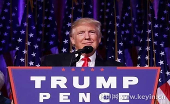
But "New York Times" to this year's annual color a lot of ridicule: Trump must also love this color, not because of his new life is about to start a president, but because of the green and the color is very similar to the dollar. So some people call it green dollar.
 PANTONE card is a world-renowned color authority, covering color printing, textile, plastic communication system, drawing, digital technology and other fields, the unified standard language of international communication has become the color information. The world has been widely used in color PANTONE standard uniform, PANTONE card has become a color transfer.
Why is PANTONE's annual representative color so strong? It may have a special meaning for consumers and brands. For ordinary consumers, this year's color may become a reference when consumers shopping. For businesses, the appearance of this year's color means no doubt greater business opportunities. In 2017, greenery should be in an unusual frequency in our daily lives.
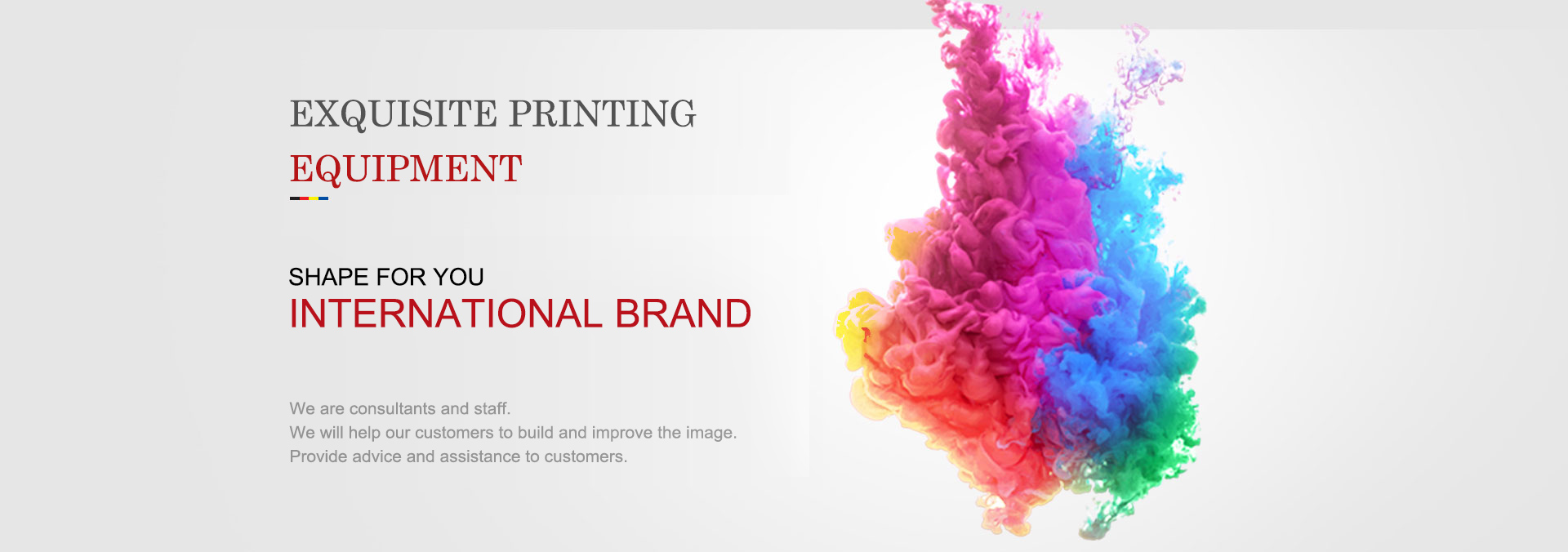
In the printing industry, color is also an important topic, cite a simple example: consumers need a blue, who also said it was not clear what is blue, but if the PANTONE card number, you can easily find the blue color, already standard PANTONE throughout the US life everywhere. The PANTONE color standards and our printing industry is closely related.
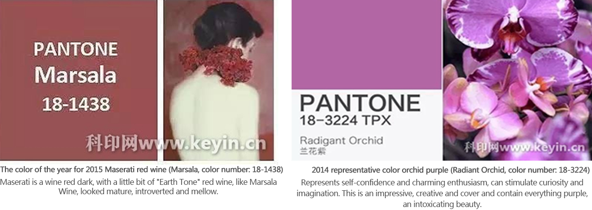
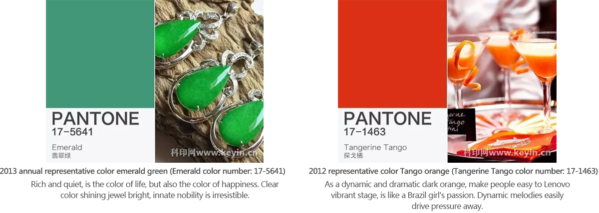
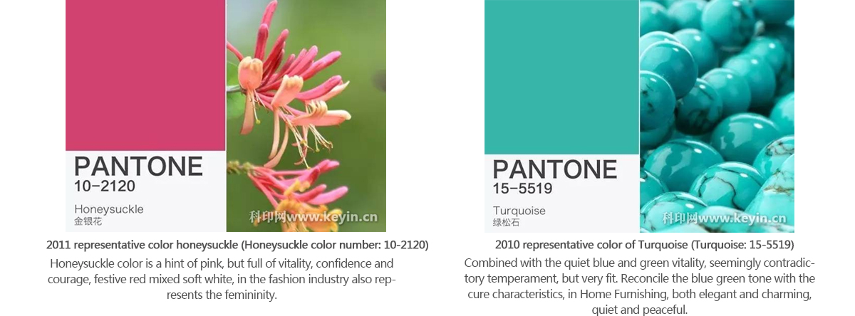
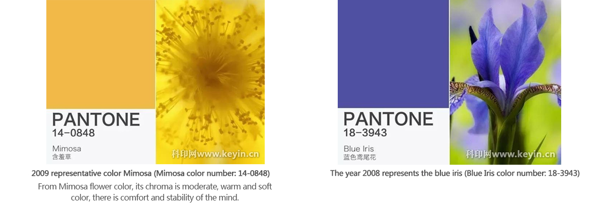
Let us take a look at the calendar year of the PANTONE color:
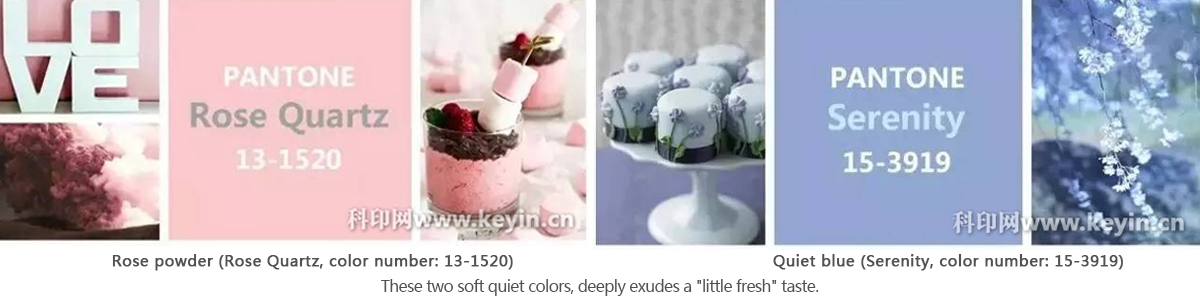
2016 color rose powder (Rose Quartz, color number: 13-1520), quiet blue (Serenity, color number: 15-3919)<>
This is the PANTONE since the 2000 release was first released two annual annual color color, that is to "societal movements toward gender equality and fluidity" (modern society promote gender equality and mobility).
 中文
中文 ENGLISH
 日文
日文